Introduction to Box Art Brawl
Welcome to another exciting edition of our Box Art Brawl series, where we dive into the world of video game cover art and its impact on player perception. In our previous episode, we explored the charming visuals of Final Fantasy Fables: Chocobo Tales for the Nintendo DS. The competition was fierce, but North America emerged victorious, securing a staggering 71% of the votes cast. Today, we shift our focus to a classic from the Super Nintendo Entertainment System (SNES) era, namely Bubsy in Claws Encounters of the Furred Kind, as we eagerly anticipate the release of Bubsy 4D on the Switch and Switch 2.
This game marked the beginning of a tumultuous journey for the beloved bobcat character, Bubsy, who has continued to capture the hearts of gamers over the years. As we examine the different box art designs from various regions, it becomes apparent that while some elements remain consistent, there are unique aspects that make each version stand out. Let's take a closer look at these variations and understand what they bring to the table.
Box Art Comparisons
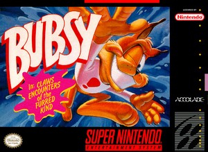
When it comes to the box art for Bubsy in Claws Encounters of the Furred Kind, both North America and Europe present strikingly similar designs, yet there are subtle differences that warrant discussion. The North American cover art prominently features Bubsy himself, striking a confident pose against a classic black border that is characteristic of many US SNES titles. This design choice effectively highlights the central artwork, making it instantly recognizable to fans of the series.

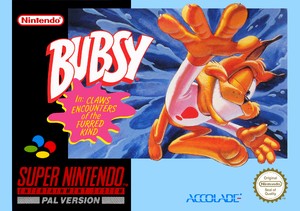
On the other hand, the European version retains the same core design but introduces a lighter blue border and a slightly adjusted logo placement. This color choice complements the main artwork while creating a cohesive visual experience. Although the differences between the two are minimal, they reflect the distinct marketing strategies employed in each region, aimed at appealing to their respective audiences.
Japan's Unique Approach
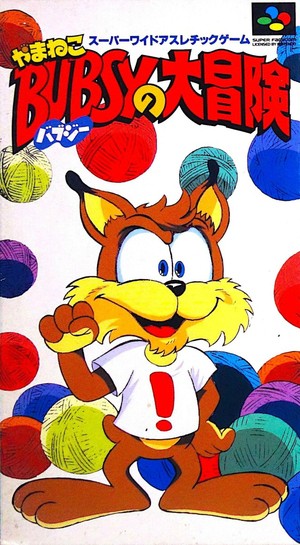
In stark contrast to the Western designs, Japan opted for a radically different approach when creating the cover art for Bubsy in Claws Encounters of the Furred Kind. This version utilizes a portrait orientation that allows for a fresh perspective on the character. While Bubsy's pose may not be as expressive as his Western counterparts, the Japanese cover art captivates with its striking white background and a bold red logo that draws the eye.
Moreover, the Japanese artwork cleverly incorporates elements that resonate with the game's narrative, such as the yarn balls, which are integral to the gameplay experience. This creative choice not only enhances the visual appeal but also reinforces the identity of Bubsy as a character within the gaming community. It's clear that the Japanese designers took a unique route, resulting in a cover that stands out from the rest.
Community Reactions and Thoughts
The gaming community has expressed varied opinions regarding the different box arts for Bubsy in Claws Encounters of the Furred Kind. Many players have shared their fondness for the Japanese cover, citing its retro aesthetic and nostalgic feel reminiscent of 1970s anime. Comments from fans highlight the charm of the Japanese illustration, with one player noting that it reminds them of the beloved anime Sherlock Hound, showcasing the influence of pop culture on perceptions of game art.
Conversely, some fans prefer the North American cover for its overall composition and the way it features Bubsy prominently. The sentiment among players is divided, with some appreciating the full view of Bubsy in the European version, which allows fans to connect more intimately with the character. This highlights how personal nostalgia and cultural context can significantly impact player preferences when it comes to box art.
ZenilGames Commentary
As we delve deeper into the discussion surrounding the box art for Bubsy in Claws Encounters of the Furred Kind, it’s essential to consider how these designs resonate with different segments of the gaming audience. In North America, the black border and bold colors evoke a sense of nostalgia for many players who grew up during the height of the SNES era. This familiarity plays a crucial role in shaping their connection to the game and its characters, fostering a sense of loyalty that extends beyond just gameplay.
Furthermore, the design choices made for the European version reflect a more playful approach, with Bubsy bursting out of the frame. This creative detail not only adds dynamism to the artwork but also mirrors the energetic and humorous nature of the game itself. European gamers often appreciate such artistic flair, which can make all the difference in how a game is perceived even before it’s played.
On the other hand, the Japanese art style, with its minimalistic yet striking design, appeals to a different audience altogether. The use of white space and the inclusion of the yarn balls serve to create a unique identity that sets it apart from the more conventional approaches seen in the West. This artistic choice not only captures the essence of the game but also speaks to a broader trend in Japanese design philosophy, where simplicity and elegance often take precedence over elaborate visuals.
Frequently Asked Questions
What is the significance of the yarn balls in Bubsy?
The yarn balls are essential collectibles within the game, serving as a core component of the gameplay and contributing to the overall narrative.
How does the box art influence players' perceptions of a game?
The box art serves as the first point of contact for potential players, shaping their expectations and influencing their decision to engage with the game.
Why are there such different styles of box art across regions?
Different regions often have unique cultural preferences and marketing strategies, leading to variations in design that aim to resonate with local audiences.